Color represents a beautiful sensation creating distinct emotions in the life of a human. We view various things and then establish a distinction between the similar objects by using color. We thoroughly feel the essence of color as a component creating distinct emotions when viewing it. In a pragmatic life, the color does not exist. We formulate colors utilizing our brains, meaning that colors remain subjective in nature and are not objective.
In design, colors act as major key function grabbing the attention of users. Colors are considered the easiest aspect which you can remember when you encounter new things for the target audience. The design colors always represent a connection with the branding of the product. The designers of the product utilize the color as a manner to interact regarding the product. Generally most of the times, the users strews ideas on basis of color. There involve a few facts which are very essential when it is about color psychology.
Fact No.1: The preference of color goes along with the difference in gender:
As per the findings generated by Joe Hallock, it quotes that there involve considerable distinction in between preference between the genders when it comes to the color selection. This study was conducted for most and least favorable colors. Moreover, there exists a considerable favor for blue color for both women and men while the orange color was the most despised color by both the women and men. In this particular analysis, it was also found that men are the ones who prefer bold colors while women prefer soft colors.
The details for the findings make you comprehensible when it comes to the portion of product design.
Fact No.2: The utilization of color is dependent on the product and services:
At the time when it comes to the application of the design, most people look to the color before buying. For instance, G shock related wrist watches are popular because they are hardy and durable. When users visit the G shock website, they exactly feel the same trust towards wristwatch.
Proper use of color brings forth great user personality who uses this application. In the G shock website, you will notice that they use such bold colors that easily grab the users’ attention who like viewing trendy things instead of professional stuff.
Fact No.3: Color assists in making the product recognizable:
The design of the product is not about being comprehensible but discoverable as well. Our mind likes to concentrate on the brands that are recognizable immediately. To formulate and make the product appear recognizable and engaging, you must utilize the color in a proper manner that aligns well with the business personality, ideas, emotions and which is different from the competitors.
Studies have revealed that color is the basic factor when it comes to dealing with direct competitors. The utilization of the color is common in the restaurant and food industry where the designers utilize the outlook of product considerably basis unique colors. If you take a look at KFC, Mcdonalds, Starbucks and various dine in brands that have various branches, you will that they heavily concentrate on unique designs and colors.
Essential thing is to focus and understand the reaction of the customer towards various colors rather than concentrating the colors itself. Your color must attain the aim of what you are trying to endow to your users.
How do colors have an impact on design?
There are various articles which might enable you to figure out how colors have an impact on the design. Listed below are the examples showcasing how the physiology of colors has made an impact on the design?
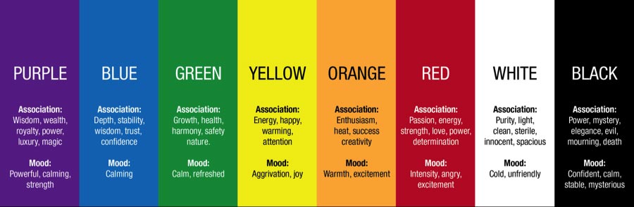
Blue:
Blue is a common color when it is about designing a product. The color blue is considered to endow emotions like safe, trust and relaxation.
Blue has distinct shades of color that make it represent a different set of emotions. Light blue color endows emotions like calm and makes the end user feel fresh. The blue color also represents happiness. By using the color blue more than the feeling of friendliness, you tend to create the trust for the users.
Pink:
The color pink is related to sugary and candy items. Generally, it is called a girls color. The color pink is a color of joy and playfulness as well.
Black:
Black is a desired color in the spectrum. The color black portrays formality and power. The color is said to be the strongest color of the spectrum.
Red:
Red denotes, a sense of importance notifying you regarding danger. Red is a color which states that the audience must pay attention to what is displayed. For instance, the traffic light is red in color indicating you to stop. Also, red is a color of love and passion.
Green:
Green is a color which is connected to the trees, environment, and plants. Generally, most of the times, the organization that sells off the beverages or organic food utilize green color. As this color is natural to the eyes, it grabs major attention.
Color does help the user’s get attached to the brand emotionally. Colors can be used to trigger emotions as it assists to garner an upper hand in competition.